Nature-Culture Corridors
This map started as a collaboration with artist~facilitator Ela Spalding, with the goal of visualizing human action in the protection of the land, in what Ela conceived as natura-culture corridors. The idea was to create a map based on the Panama natural corridors map, scaled up for exhibition at the Museum of Contemporary Art of Panama (MAC) in an exhibition about the amazing work of Estudio Nuboso over the last 10 years.
Dominique Ratton, with her extensive experience in textile printing, joined the team and proposed creating a cartographic piece on fabric. The result was an experimental map where we explored telling the story of biocultural connectivity through transparency, light, and a tactile, interactive materiality.
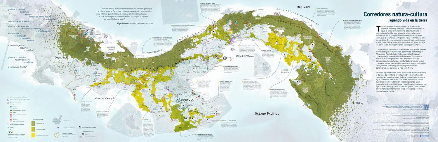
The map allows visitors to the exhibition to see how humans come together within the framework of ecological connectivity. It represents community-based organizations (CBOs) and rural water management boards (JAARs), which form a true swarm of human action. Indigenous territories, such as autonomous comarcas and collective lands, are also included, forming an integral part of this network of territorial care. The map conveys a sense of possibility and hope by showing how organized communities protect forests and water both inside and outside of the natural corridors.
I made a companion web map that will get updated with info from the workshops that the Estudio Nuboso team is doing in the MAC museum. See technical details on the web map here.
These are the three layers of the map in the MAC gallery (thanks to Alfredo Martiz and the Museum of Contemporary Art for the photos):
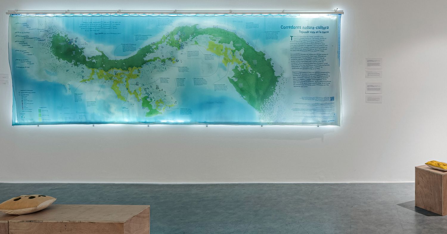
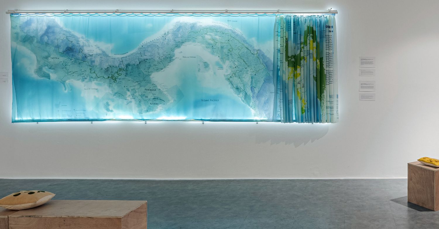
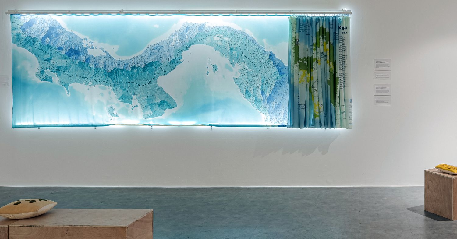
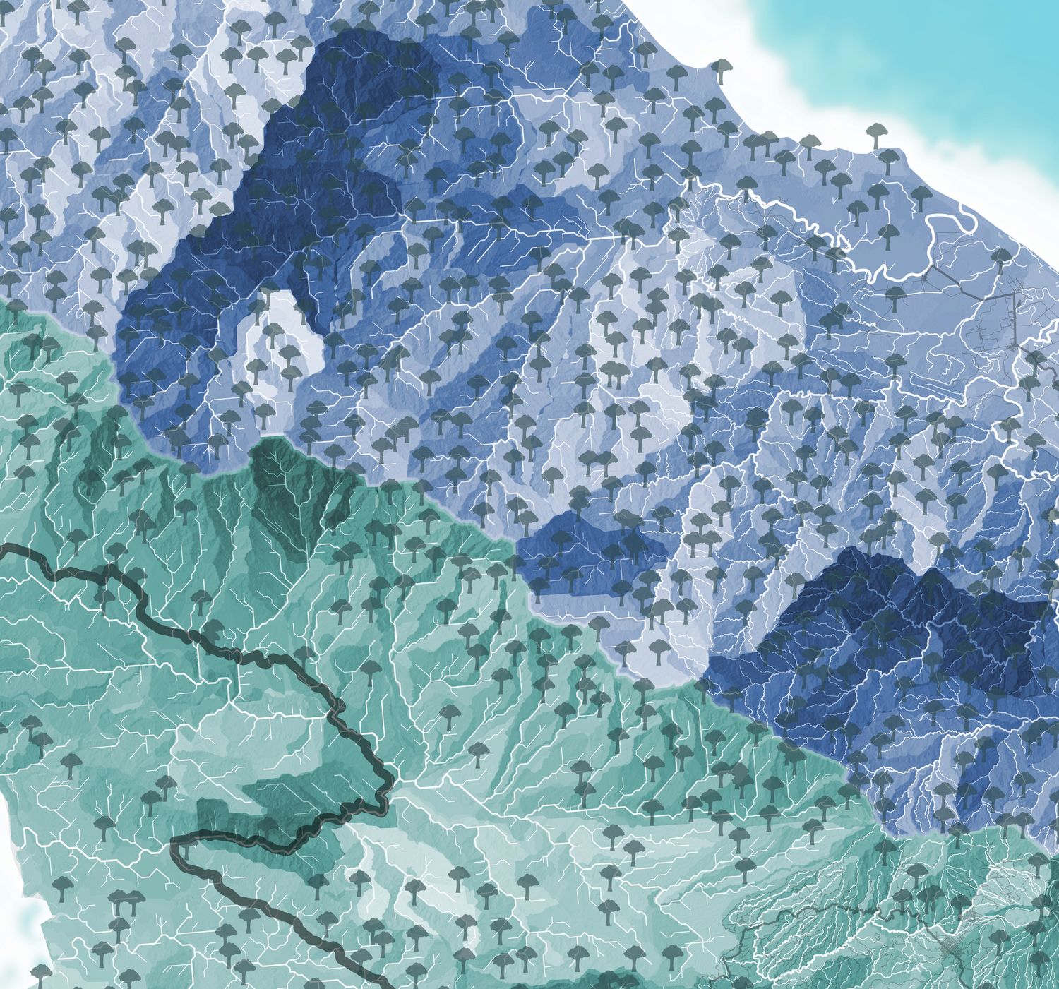
The piece is 4.2 meters long and consists of three backlit fabric layers. The base, mounted like a lightbox, represents the territory of Panama and beyond through watersheds, along with main roads and highways. The territory is divided between the Caribbean and Pacific slopes — the great watershed divide of the Central American isthmus — in different colors. The top layer, closest to the viewer, includes the natural corridors and elements of community organization. The middle layer contains towns, indigenous territories, and protected natural areas, as well as possible threats and environmental alert points, such as mining and deforestation hotspots.
The map is interactive and allows for physical manipulation of the layers. While the main narrative lies in the top layer, viewers can discover different readings of the territory by overlaying and moving the layers, generating combinations that reveal new connections. None of us had done anything like this before. I think the result was quite successful and left us with valuable lessons for further experimentation.
Technical Details
Designing a piece of this size from a computer screen isn’t exactly intuitive, but this is the second time I’ve done it. You have to consider details like the average height of viewers, accessibility, color contrast, and viewing distance. We used guides like this one from the Canadian Museum for Human Rights.
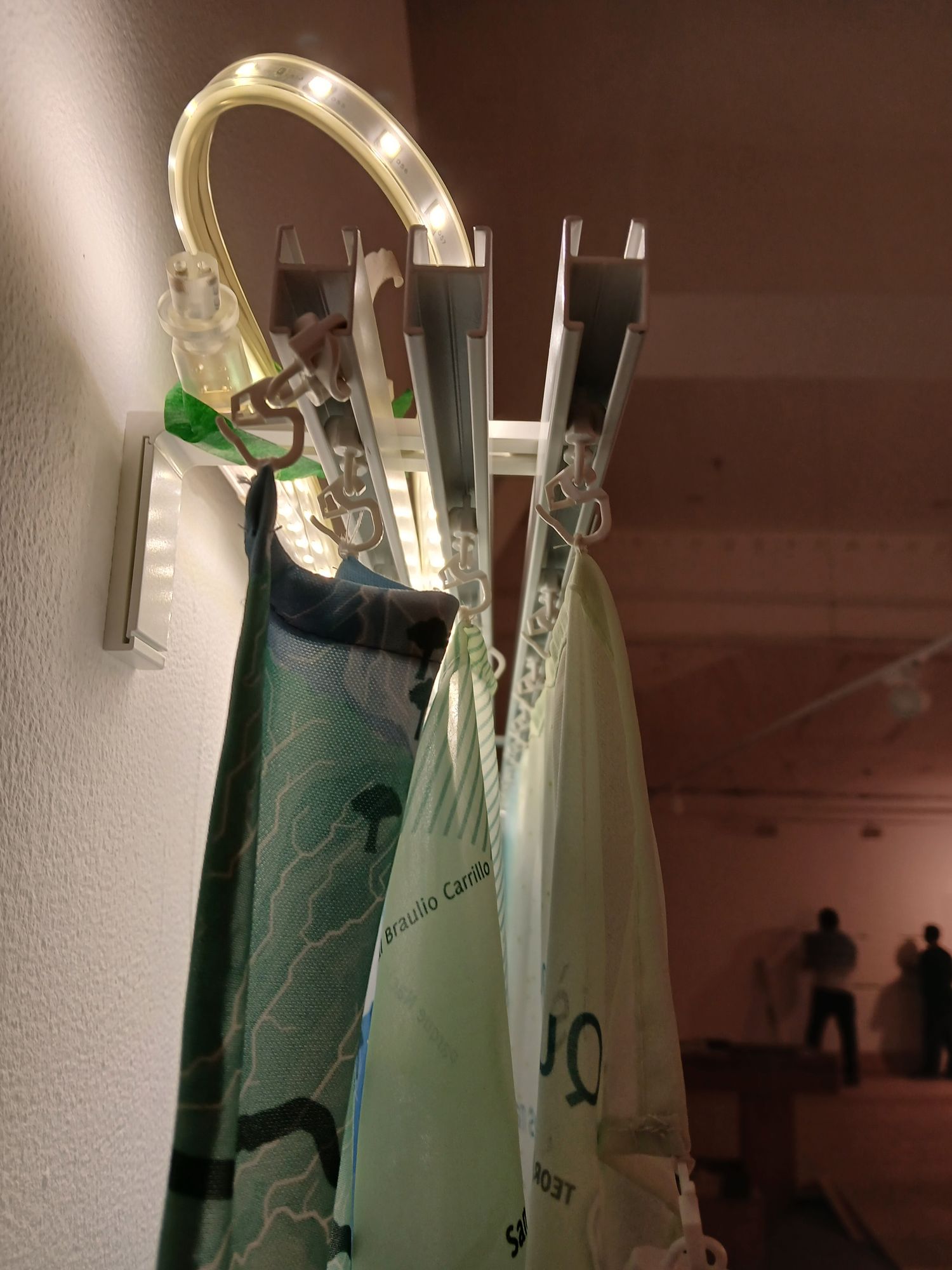
We used pique fabric for the base layer and chiffon for the front layers. Behind the base layer are LED strips that illuminate the museum’s white wall, creating a lightbox that serves as the piece’s only source of light. The front layers are suspended using three Ikea curtain tracks, each made of three 140 cm long rails. The three fabric layers are spaced 4 cm apart to allow for transparency.
For the base layer at the back of the map, I used a technique I’ve been refining since the Pacific map: vector-based shading derived from watershed polygons. First, I generate “half-watersheds” at multiple scales using a digital elevation model (with r.watershed from GRASS GIS). Then I calculate the aspect (orientation) and slope of each polygon, and from that, the amount of light it would reflect at a given solar position (using formulas from here). I then overlay layers in QGIS and Krita with different sun orientations and watershed scales, experimenting with opacities until it looks right. I’d love to create a tutorial on this technique sometime, as it allows for a clear and expressive depiction of relief.
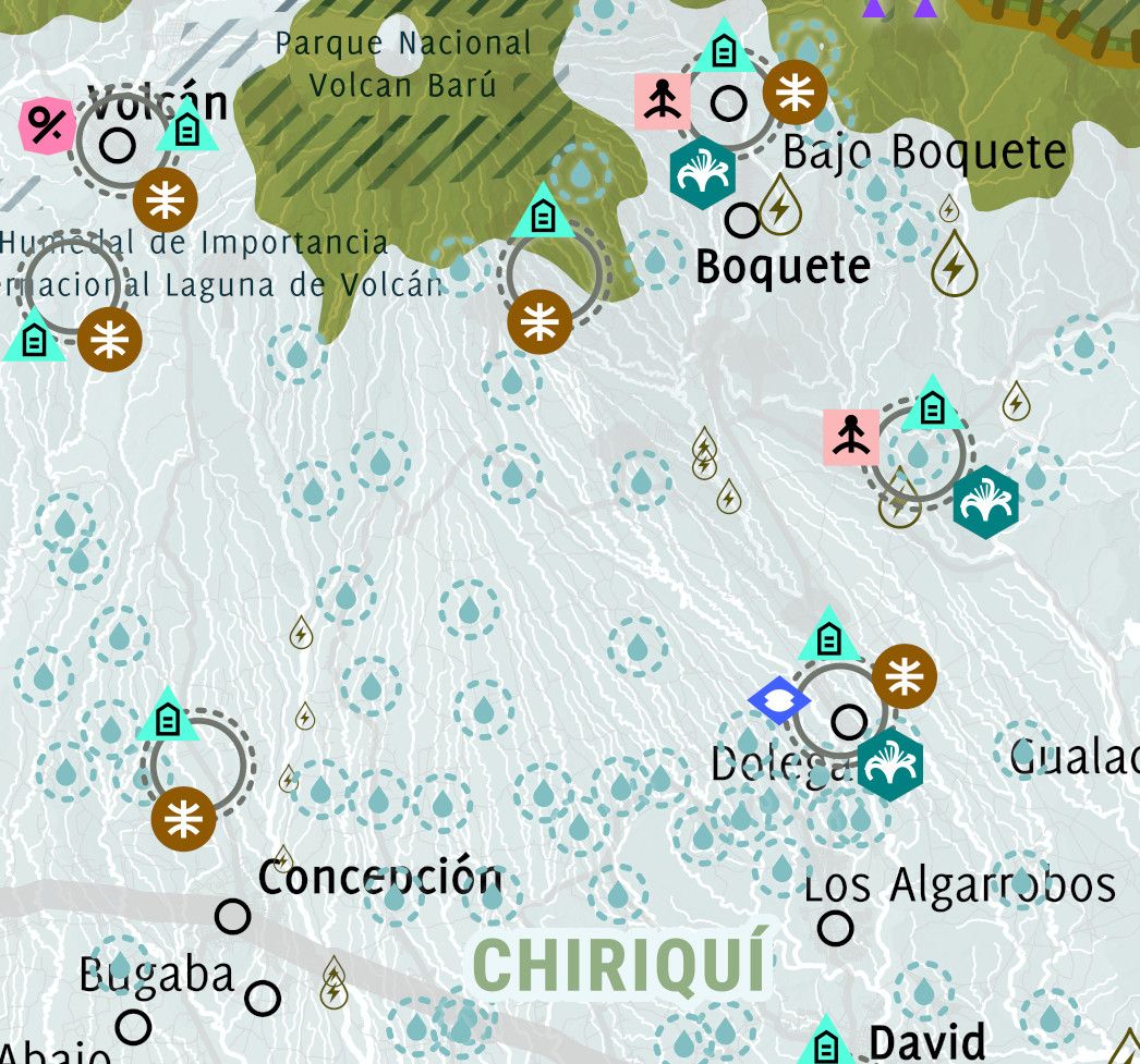
I couldn’t find a geographic layer for the local water boards or JAARs, which is what these rural aqueduct management organizations are called in Panama. But I felt it was essential to include them, as they are probably the country’s most important form of community organization. I found a 158-page PDF from the Ministry of Health listing over 3500 JAARs. I converted it into an Excel spreadsheet, then matched entries by community name and administrative division, managing to georeference just over half. With more time, I could try to refine the data and map the rest manually. Doing these kinds of acrobatics is pretty normal in Panama, where geospatial data is scarce and the state publishes only a fraction of what it produces.
The data on other community organizations comes primarily from a study conducted by my colleagues at Almanaque Azul for the Ministry of Environment, to which I added other active land defender groups in Panama, like the Guerreros del Mar and Despierta Donoso. There are still many more to include.
- Fabric print
- 4.2 m × 1.3 m
- For: Museum of Contemporary Art of Panama and Estudio Nuboso
- Mir Rodríguez Lombardo with Dominique Ratton Pérez and Ela Spalding, February 2025