Food of Mexican Cultures
This map was a project by Genoveva De La Peña, then director of Cencalli, Casa del maíz y la cultura alimentaria. It was commissioned for one of its halls. Cencalli is an initiative of the Ministry of Culture, within the Los Pinos Cultural Complex in Mexico City. It is a museum, a documentation center, a milpa, an orchard, an agroecological market, a food culture store, and a space with traditional Mexican kitchens.
Click or touch the map below so you can zoom all the way in.
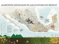
The first question, then, was: what does a food map mean? It can be many different things. Together with Alexander Ortega Sepúlveda, an expert in Indigenous cuisines, we decided that the map would feature ancestral ingredients that are still eaten in this territory and where they are grown. This left out things like bananas, lemons, and rice, which are widely cultivated and are fundamental ingredients in Mexican cuisine, but are not native to this place. Alexander and Mauricio Ávila, of the Cencalli team, decided on the final list of “essential foods” that is shown on the map
The overall concept of how the map would look was done together with artist and illustrator Sari Denisse, with whom I developed the portrayal of cyclical time centered on the cultivation and harvest of the milpa, and with whom I also decided on the exact orientation of the map. I then partnered for the design with the illustrator Kitzia Sámano Valencia. Working with Kitzia was an absolute pleasure, as we both enjoy focusing on nerd-level details, researching many references, and validating the designs together. She designed the food icons and the milpa with all its human and non-human characters.

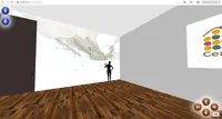
This map is designed for a 4.4 x 3.3 m (approx 14.5 x 11 feet) wall, and that was a major challenge. It’s very difficult to imagine how something of that size will look from looking at a monitor. To solve this problem, I turned to A-Frame, a tool that simplifies coding virtual reality experiences (in HTML and JavaScript) viewable through an internet browser like Firefox. Using an old Oculus Quest 1, I was able to see the wall up close and from a distance, to walk along the wall and to adjust the size and position of the map elements. It also helped show the almost finished map to the people at Cencalli.
The finished map was about 52K x 39K pixels, or just over 2 billion pixels. The process of producing and merging those layers was not easy, and I documented it in a tutorial.
The Essential foods of the cultures of Mexico map is published for the first time in this portfolio for the first time to make it freely available for consultation. It is published under a Creative Commons CC-BY-SA license, which allows reuse and remix as long as the source is cited and it is shared under the same licence.
Map by Mir Rodríguez Lombardo and Kitzia Sámano Valencia,
Original idea by Genoveva de la Peña Chávez,
Research by Alexander Ortega Sepúlveda and Mauricio Ávila Serratos,
Concept by Sari Denisse.
Technical details
This map took about nine months to make. It is based on the polygons of the agrarian units (núcleos agrarios) of Mexico, which are the collective lands (ejidos and agrarian communities) of this country. The available data indicate what is grown and on what surface area. The size of each icon represents the planted area, as can be seen in the legend. The vast majority of the data on the map comes from this source, but others, such as fish, come from the data on planted surface by municipality. Grasshoppers and bees are shown in the places where they have been observed. Community seed banks are just some of the ones that exist in the Mexican territory.
We chose eight varieties of corn to represent the eight racial groups that bring together the enormous variety of corn that exists and are shown where they mostly grow. We also selected them to have a variety of colors and shapes, so that this diversity would be visually represented.
The boats indicate the foods that came from outside after colonization and where they came from.
The map background is an interpretation of the Inegi land use and vegetation map, which has many categories that were consolidated here.
The scale is a nod to colonial cartography: it is inspired by the scale of Egnazio Danti’s maps in the fabulous Map Gallery at the Vatican Museum.
The map is drawn in a Mollweide (equal area) projection with its origin at the Zócalo of Mexico City and a rotation of about -32 degrees to reduce the latitudinal hierarchies of the maps of Mexico that have the north up.
The icon designs and the drawings of the milpa were made by Kitzia in Illustrator and exported to SVG to include them in QGIS and Inkscape. The icons have slight random rotations (in the case of the beans the rotations are not so slight) to make the map less mechanical.
- 4.43 m × 3.32 m
- For: Cencalli, Casa del maíz y la cultura alimentaria / Secretaría de Cultura de México / Complejo Cultural Los Pinos
- Mir Rodríguez Lombardo and Kitzia Sámano Valencia, November 2022


