Natural corridors of Panama
Life on Earth is a network that only exists if it’s spatially connected. Ecological connectivity is a fundamental feature of nature, necessary for the functioning of ecosystems and the survival of life.
A visualization of ecological connectivity can bring together a lot of data into a simple image, which would help identify hotspots and areas of concern. So we wanted to make a map to support the work of environmental activists and organized communities around the country.
How we did it
The process began by researching the various ways of modelling connectivity. We decided to make a map of structural connectivity, which is based on the landscape, meaning: if a place is pasture, forest or football stadium; if the road is an 8 lane highway or a dirt road; whether the town is a city of 1 million inhabitants or a rural town with a population of 100. In order to prepare the model’s input we gathered land cover maps, the results of the population census, OpenStreetMap streets and rivers:
After combining these layers (resolution 30 m) we defined 20 landscape categories and consulted a group of biologists which helped us set a conductivity/resistance score each category. Mature forest has the lowest resistance to the movement of species, while maximum resistance comes from highways, cities and infrastructure. With the map and the expert scores we ran an ecological connectivity simulation using Omnisccape. This is an application which uses circuit theory to simulate connectivity, as if living beings were electrical charges moving across a circuit.
What we discovered
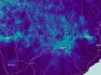
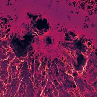
The results, after trying the simulation with different parameters, were very interesting and they revealed paths of connectivity that we did not know about.
But these maps were difficult to interpret. From the beginning our idea with this project was to give a tool to communities and activists to defend nature and also something that could be used in the classroom. We tried different ways to try to make the results easily understood by non-experts:
Corridors
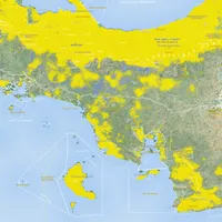
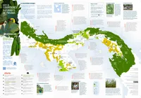
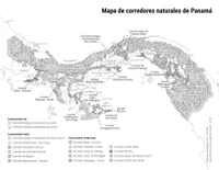
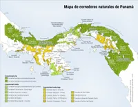
We then had the idea of drawing the regions with highest connectivity and to give them a color based on the average connectivity found there. We called those polygons natural corridors and we named them. We believe that naming each corridor is essential to have people feel identified with them.
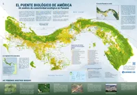
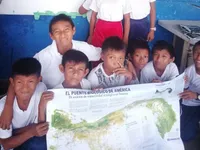
We designed a 98 cm x 68 cm poster, thinking that it should be useful to schoolteachers. The poster has small notes on various issues, such as the importance of ecological connectivity, the importance of forests and the threats they face. The poster has two sides: one with the map of natural corridors,
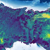
and another more technical side, with the more raw results of the analysis and detailed information.
Classroom posters
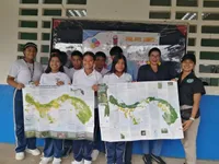
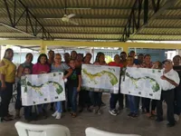
We printed a first run of 5000 of these maps and we have been distributing them organically through teachers, community organizations and activists.
There are also letter-size downloadable versions.
All maps and data are freely available in the Almanaque Azul website.
The dynamic web map
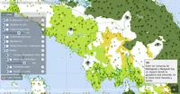
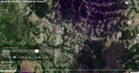
I made this web map to go together with the paper map to allow more detailed visualizations and analyses.
The map displays the results of the connectivity analysis from the model. A slider filters the conductivity levels that are displayed. The results of the model have a resolution of 30 m which means it is possible to zoom in and look at connectivity effects at the property or city block level.
I used these technologies
This map was developed using OpenLayersand the layers are loaded the fantastic serverless technology now available: Protomaps and Cloud Optimized GeoTIFF. Thanks to that we are able to host the data using a regular shared web server, without the need to have a server such as GeoServer or ArcGIS Server.
You can see the Panama natural corridors web map here.
How it happened
The masterminds behind this map were Rossie Pope-Meyer and Charlotte Elton, activists and thinkers on the ecology of Panama. They identified the need for a map like this for a territory often considered an ecological land bridge and invited Almanaque Azul to bring the idea to reality.
- Posters, downloadable maps and web map
- Various sizes
- For: Almanaque Azul
- Mir Rodríguez Lombardo y Michelle Szejner con Almanaque Azul, 2022-2024


