Central America Moves
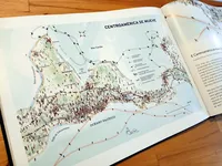
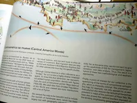
This map was commissioned by the Revista de la Universidad de México for its July 2023 issue on “Central America”. They simply told us: “make a map of Central America.” We began by discussing what stories we wanted to tell. One topic that particularly interests us is the mobility of living beings across the isthmus, both human and non-human. In the context of environmental and social crises, this territory has once again become a critical corridor.
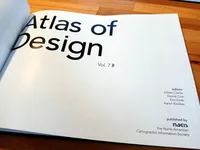
Centroamérica se mueve was selected for the 7th edition of the Nacis Atlas of Design.
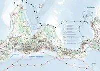
Gabriela Fenner and I are together in the Cartographic Collective of the Global South, an informal group of mappers from Mexico and Central America that was formed during the pandemic. A point of interest for us in the collective is the questioning of the norms of conventional cartography, which is inherently colonial. The orientation of this map, for example, not only appeals to us aesthetically, but also reduces the latitudinal hierarchies predominant in maps of the Abya Yala continent. We have also erased the national borders imposed on the territory, emphasizing geographical continuity.
We drew the most common path of humans on the move, which has an overall south to north direction. Data was gathered from several sources, among which media reports were of great help, since there is little official data and the routes are constantly changing. This flow is different from the round-trip routes of animals, both by air and sea. We chose one species per ocean, for visual balance, and one land route to show the diversity of movement. Bird migration data is easy to find with Audubon’s Bird Migration Explorer, but for other taxonomic groups it is necessary to delve deeper into specific studies.
Although Central America is often referred to as a “bridge”, for us it is also a highly diverse inhabited space. To show this dual dimension, we represented the density of the settled human population with figures from the work of Salvadoran painter Maya Salarrué (1924-1995). We used data from Gridded Population of the World and created skin tone distributions with a bit of Python.
We wanted the map to be beautiful and to have the warmth of hand-made work, something that has largely been lost with geographic information systems. But we also wanted to take advantage of the capabilities of GIS to manage, represent and analyse data. The map is a hybrid of these two methodological and aesthetic approaches.
- Papel
- 37 cm × 26.5 cm
- For: Revista de la Universidad de México
- Gabriela Fenner Sánchez and Mir Rodríguez Lombardo, julio de 2023


