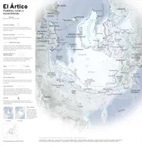
The Arctic
The idea for this map came about with the recent attention that Greenland has received. To me, Greenland is this huge white island that appears on top of the Americas and little else. Who lives there and why is it suddenly in the spotlight? There’s nothing better than making a map to learn about a place.
The Arctic has been in the news for another reason: a study found that it has gone from being a CO2 sink (taking carbon out of the atmosphere) to a source of carbon dioxide.
Greenland, or Kalaallit Nunaat as it is called in Greenlandic, is in a region of the world called the Arctic that is often poorly represented on maps. When you map the Arctic using any of the polar projections out there, it’s clear that from a geopolitical perspective it’s a key location. And with climate change and the shrinking ice cap, the possibility of shipping routes through it opens up, which could in the future make the Panama Canal obsolete.
Panama has also been in the news lately, and for the same reason as Greenland. It seems unlikely but it is true: tropical Panama and polar Greenland are now sibling peoples in the attention we have received from the United States.
There are many indigenous peoples around the Arctic, with living cultures and languages. Many of the Arctic peoples have suffered genocidal attacks over time, both from the governments of America and those of Eurasia. The story of how the Bolsheviks tried to exterminate the culture of Siberian peoples by executing shamans left me cold. The Inuit of Canada are famous for the participatory mapping exercise where they demonstrated their use and occupation of their territories, which culminated in the creation of the province of Nunavut.
The tundra and taiga intrigue me as ecosystems and I still know almost nothing about them, except that they are the coldest biomes in the world and that the taiga or boreal forest is the largest biome after the ocean. There are some animals and plants with circumpolar distributions, but I settled on two mammals that are found everywhere here: the reindeer and the beluga whale. With more time I would add some plants. I also found the tree line very interesting, like all natural borders.
Some technical details
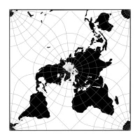
I originally wanted to make the map in the AuthaGraph projection, but it is not available in QGIS, so I settled on the Peirce quincuncial, with a few minor adjustments. I love the way it depicts the part of the world where humans live, at the cost of breaking up Antarctica in 4 pieces (unless you tesselate it).
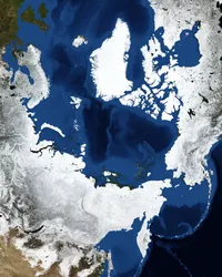
The map background is a Nasa image from the Blue Marble project which published global mosaics for each month of the year. This one is from February 2004 but all that snow at this time of year may no longer be realistic. I had to georeference the image because it’s only available in JPG and PNG.
The ice density is from a NOAA monthly report and is for January 2025. The magnetic pole, which moves every year, is also from NOAA. The indigenous peoples are derived from an Arctic languages map from the Arctic Council’s Indigenous Peoples Secretariat, using AI to convert the language names to the name of the people who speak it (required quite a bit of manual intervention).
Finally, the typography. I’m experimenting for the first time with Overpass, which used to be one of the fonts for the Revista de la Universidad de México. I like that it has a lot of variants, which is handy for establishing hierarchies on maps.
- Static
- 42 cm × 42 cm
- For: Unpublished
- Mir Rodríguez Lombardo, february 2025


